Color + Emphasis Collage:
- Nov 13, 2025
- 1 min read


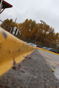


I chose the color yellow and principal of design emphasis. I chose yellow because it's a perfect time of the year to use fall colors to use. For example: the yellow leaves bring out the fall vibe. During these photo shoots I've learned to use the season to use like fall and it's leaves and trees, summer it's bright flowers and amazing sunsets, winter and its snowy mountains and streets filled with snow, and springs flowers blooming.
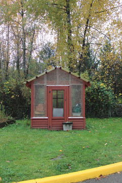
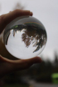
I chose emphasis because I'm used to taking photos while using emphasis. My photos demonstrate it by all the photos bringing focus to the center of the photo. And again during these last shoots I've learnt to try different ideas and go for it. Like my mirror ball photos I didn't really know what to do but I had an idea to get a reflection of the trees and garden hut out in the back of the school.


Comments