
Rolling The Dice
Mud Photo: Texture Pattern & Repetition Purple Dice: Colour Pattern & Repetition Grey, Black, & White Dice: Value & Emphasis Forrest Photo: Space & Emphasis Shrub Photo: Texture & Emphasis Pine Photo: Colour & Emphasis •For the mud photo, it’s all about the texture. The pattern of the tire tracks is perfect for the photo and same with the repetition of the tracks and goes perfectly with the principles of design and elements of art. •For the purple dice photo i thought the p
Mar 101 min read


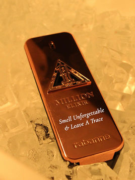
Product Photography
Colonge: In my photos for my colonge I used color and emphasis. For emphasis the photo of the cologne focuses on the bottle and for the colours i used warm bronze and gold colours to make the cologne pop. Coca-Cola: In my Coca-Cola photos I used colour and texture. For colour the red and white of the logo makes the can pop and the texture of the condensation makes it more visually appealing. Monster: For this energy drink advertisement i used lines and contrast. The lines o
Feb 121 min read


Jan 220 min read


